Magazines: Front cover practical project
Research
2) Magazine of choice analysis:
Men's fitness
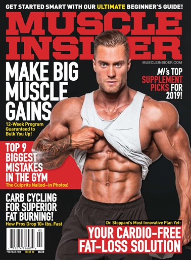
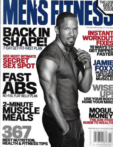
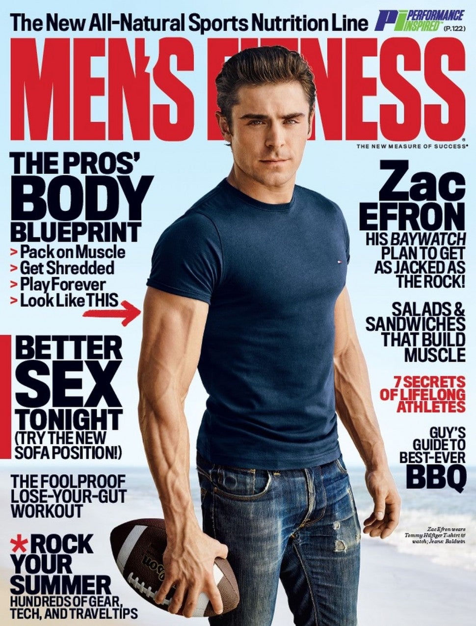
They all have a recurring motif of bold black text with yellow and red titles contrasting a white background. No shadows can be seen and the font used is modern and professional. A medium long shot is used commonly to capture the head and knees as this puts a focus on the arm/chest/torso muscles which creates a sense of masculinity. The person is normally placed in front of the masthead in order to create a sense of dominance and around the person is surrounded by headlines/titles/copy. Yellow text is normally the more important titles while red is used for main headings. Black is used for smaller titles within the magazine.


Planning
1) Plan:
Setting:
I planned on shooting the magazine front cover in my room as I had access to a big enough white wall which was easy to photoshop/crop out later in editing. I had to move some boxes around and take some paintings down and set up additional lighting and then I was ready.
Costume:
I originally went for a gym themed outfit then settled on a more casual outfit after researching other magazine covers, a simple pair of jeans and a shirt did the trick along with a watch.
Shoot:
I had my sister help me and I had to teach her how to operate the camera and we spent 2 hours taking various shots until I found the perfect one, We accounted for eye level height, lighting, costume, position ect.
After all this was done I was ready to upload my work to my computer and begin the editing process.
2) Sketch out your cover on plain A4 paper using your written planning. Take a photo of your sketch and upload it to your blogpost.

1) Once you have
completed your design in Photoshop, go to 'File > Save a copy' and
save your finished Photoshop magazine cover as a JPEG image. Then, upload it to your blogpost.
2) Upload two genuine
covers of the magazine you have chosen and put them next to your front
cover. This is a brilliant way to check how professional your work looks
alongside the real thing.


3) Write a short evaluation of your work: have you succeeded in your brief to create a new, original edition of an existing magazine? Does your cover stand up alongside the genuine covers of your chosen magazine? How professional is your work alongside those genuine examples?
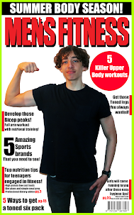
I believe that for a first attempt my magazine cover looks as the colour scheme is matched, the same style is matched and the little details such as the red boxes next to the text and the fact that no text covers the person/model. However my font could be improved to become more identical and the picture quality could be higher along with the lighting to make it appear natural and so that it "fits in" with the rest.
4) Finally, what would you do differently if you completed this assignment again?
When taking the picture I would make sure that the lighting is consistently white and there are little to no shadows or I would make myself appear black and white/mono toned. I would also make myself slightly smaller so that I could fit more copy on the cover.
.
IMPROVED VERSION:

Comments
Post a Comment