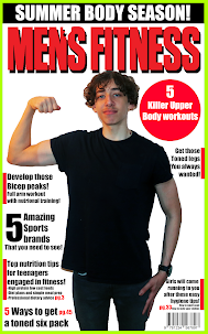
Magazine LR
1) Add your finished magazine cover as a JPEG image.
2) Type up your feedback from your teacher. If you've received this by email, you can copy and paste it across - WWW and EBIs. You don't need to include a mark or grade if you don't want to.
11/15
WWW:
Excellent use of typography, mode of address, use of language, colour scheme, central image and ambience lightning.
EBI:
Aspect ratio of the picture, bigger font with less words
3) Consider your mark against the mark scheme above. What are the strengths of your production based on the the mark scheme? Think about magazine cover conventions and the media language techniques you have used to communicate with your audience (e.g. mise-en-scene, camera shot etc.)
I am able to accurately replicate an existing magazine with the same use of colours, themes and typographies.
4) Look at the mark scheme again. What can you do to move your mark higher and, if required, move up a level?
I would need to ensure that the cover image and the magazine is the perfect size (aspect ratio) and also ensure that the copy/ text on the image is more easier to read.
5) What would be one piece of advice you would give a student about to start the same magazine cover project you have just completed?
Do not over complicate the wording/copy.

Comments
Post a Comment